Case Study Personal Project / Timeline: 1 Month / My roles: Interaction Design, UI Design
An optimal SaaS with a cohesive dashboard
Designing with data can be a huge challenge, and is inevitable in not only providing a user experience to organize files with a moderate amount of information to process but to also provide visual clarity as to not get lost within the complexities of raw data. How can we effectively provide a user experience for our dashboard to mitigate multiple windows open while effectively keeping tasks in check along with updating team members with utmost efficiency? Are we sharing the right files and is it infecting our system? We need to look at all the ways users interact with information and data by gauging how they are handling their data, tasks, and budget. By looking at each activity and identifying common patterns, administrators and users who oversee the service can get a better grasp on how to identify and address the problem.
Design Overview:
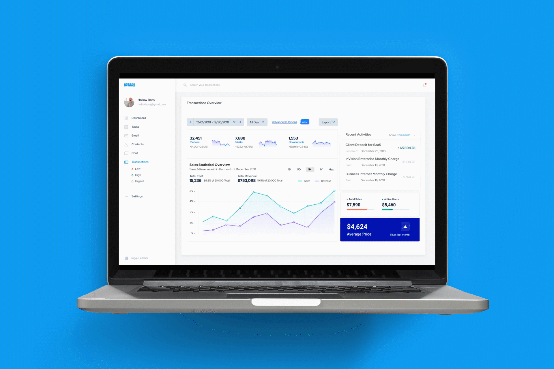
Upward is a SaaS dashboard that assists companies and fellow Upward employees view vital information and data with clarity in an organized approach without the reliance on multiple programs to keep track of keeping track on a variety of daily necesseites. With Upward, users can adjust budget, assign tasks to select team members, reach out to members with an instant chat, and contact any external parties and entities outside of the dashboard. Utilizing Upward will not only provide that extra convenience of having these capabilities in one application, but also mitigates shifting eyes and jumping back and forth on various programs with a much more visually appealing, organized approach.
The Client
Third party stakeholders and users of the Upward SaaS dashboard
The Challenge
With such a convoluted method of accessing crucial data, establishing tasks, notifying team members, and properly setting a cap on budgets for projects, it's no surprise that Upward, as a rapidly growing company, is also accompanied by growing pains of a fast startup. Fortunately, the growing pains are just some of the many user pains that can be addressed and mitigated to provide a more smooth user experience on handling the everyday necessities of organization not just on a company level but also in relation to clients and businesses that are involved with Upward.
Some food for thought would be:
• How can Upward utilize this dashboard?
• How much data & information is utilized on average?
• What are effective means to keep the team up to date?
• Why would the user prefer an all-in-one dashboard?
• What makes the dashboard much more optimal?
The Objective
Produce a cohesive solution in the form of a dashboard to properly contain SaaS-related information, data, and tasks in one application. To ensure the consistency and utilization of the product, users are also provided a messaging/email system contained within the dashboard to minimize scattered contacts by keeping all key members and individuals within reach inside the dashboard along with updating any necessary information to ensure all applicable persons partaking in tasks are aware of budget limitations, project status, recorded transactions, and locations of ongoing tasks with subfilters based on time and day.
Core Tasks
Tan Nguyen ( UX Designer )
Tools Used
• Figma
• After Effects
• Photoshop
• Jira
Pinpointing the Problem & Conducting Research
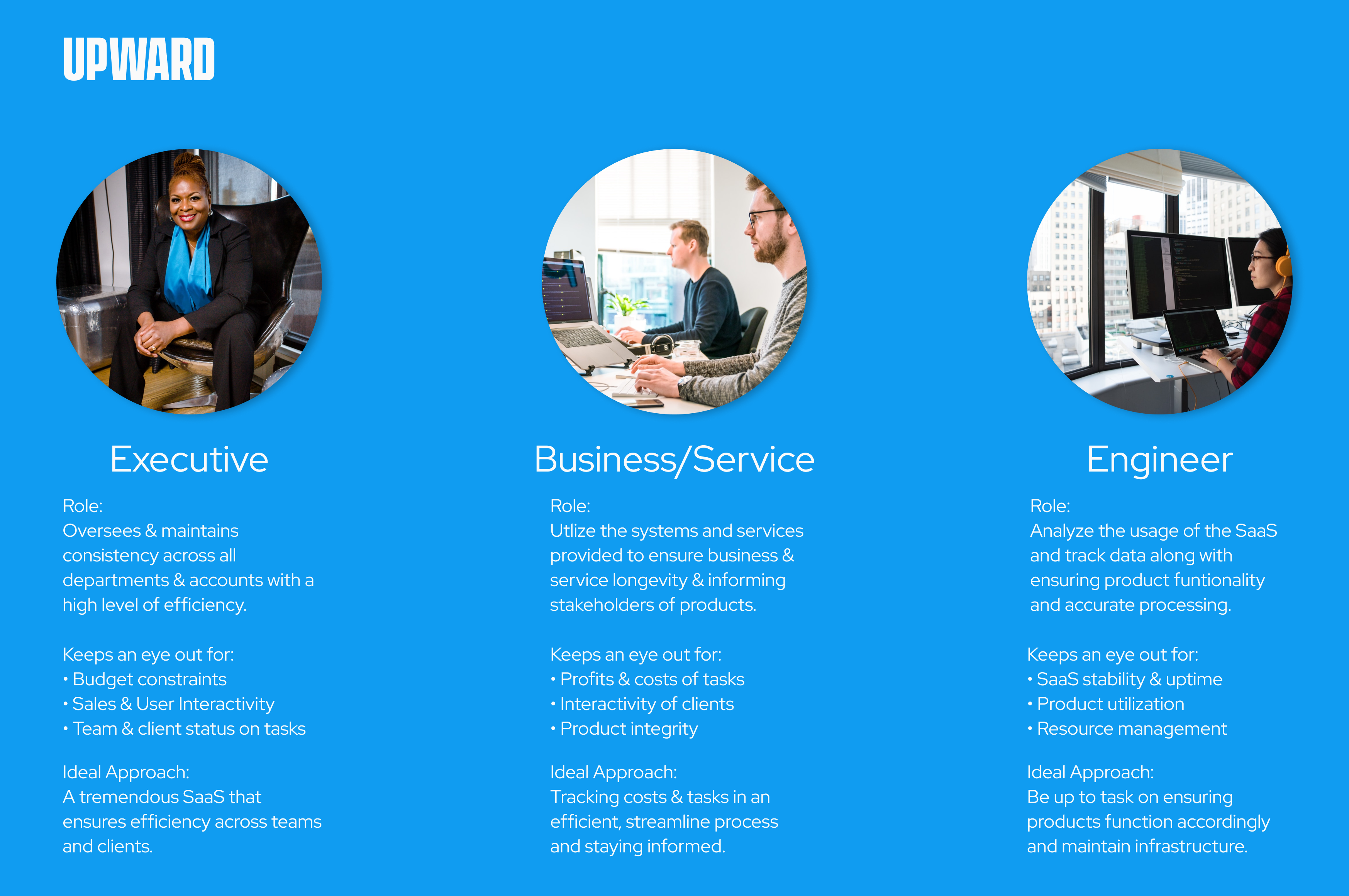
We met the main clients that are seeking to make effective use of Upward to discuss the prevalent problems and needs in greater detail. In conjunction with the research, I have highlighted the three main users, what their goals are with managing information and tasks, and how their approach fits with core factors.
In order to get a deeper understanding of how these three user types manage data and information, we needed to know where the pain points lie within the process of adopting a method of containment and organization in the first place:
- Multiple applications to enact various tasks: Having multiple programs to utilize daily functions requires extra multitasking responsibilty on top of maintaining the information in a method that can easily cause crucial information to be scattered and potentially not within the scope of other members.
- Budget constraints not effectively updated: Going hand in hand with scattered information along with an ever growing team at Upward, users are not notified of updated budget constraints, causing inconsistencies throughout the company plus clients and businesses heavily involved with Upward.
As a result, without an organized way of containing information into one dashboard, one can expect the effects of being occupied with various programs, applications and screens at once.
- Mishandled tasks & "hiccups" on the project roadmap: Each user, client, and business has a methodology on approaching given tasks and projects, which naturally differ drastically from one another. Would utilizing an innate chat and messaging system keep necessary information in check?
- Emphasis on turnaround times and relaying to teams & individuals: With the growing pains of Upward, it was a critical factor to diagnose these issues early into the company's skyrocketing growth and mitigate these issues before it spirals out of control. Now being an enterprise company, it's time that Upward has the necessary resources to manage tasks effectively, keep in line of budget restraints, and notify members and clients accordingly.
Narrowing the Approach
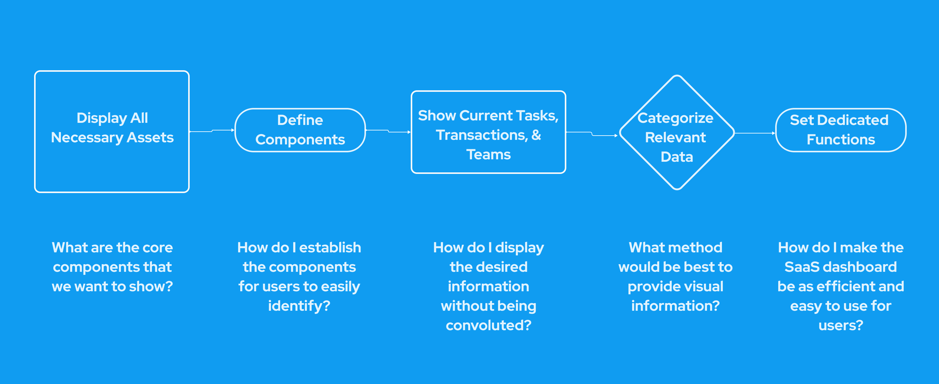
To narrow our approach ,we decided to focus on factors and aspects to ship a fully operational, organized dashboard to release in time for the company restructure. I compiled the research to ideate a process map of the users' business process for monitoring information, keeping track of tasks and budget, and having a quick way to communicate.
Defining the Approach
In chronological order, the following points go into detail of the pivotal factors in the business process that can help improve efficiency and consequently, build a better, organized strategy by providing clarity, task specifications, budget constraits, and other core issues elaborated earlier.
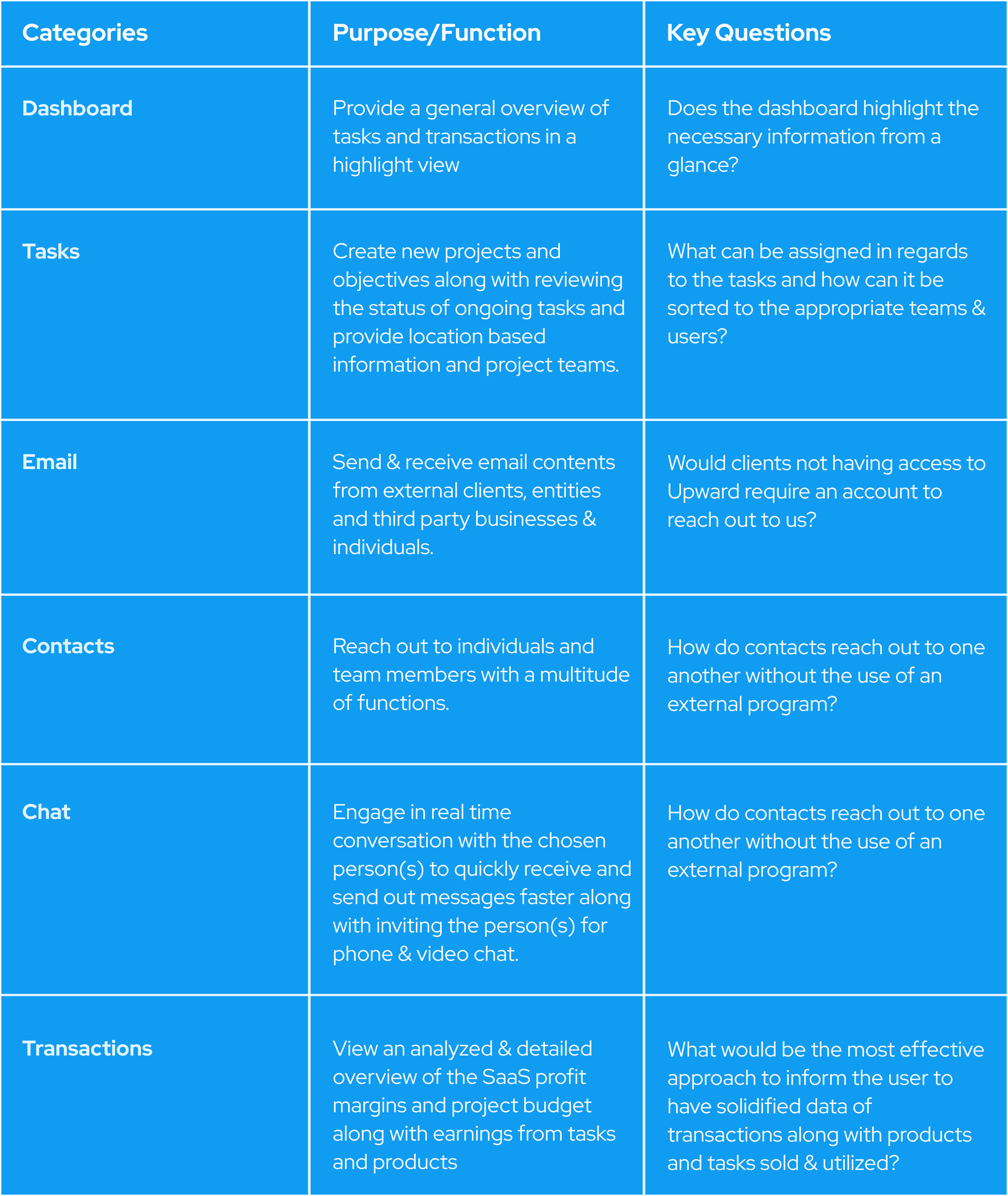
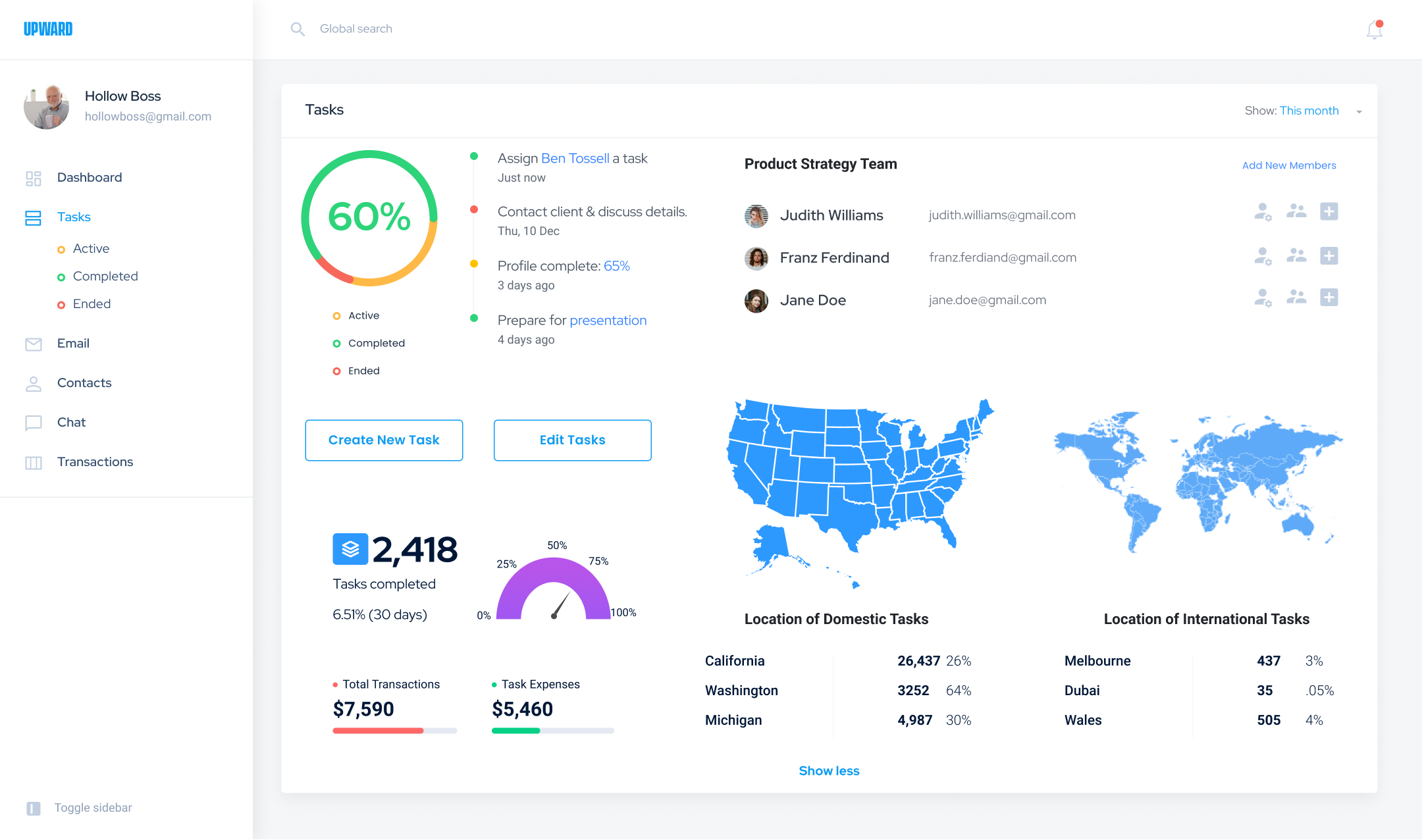
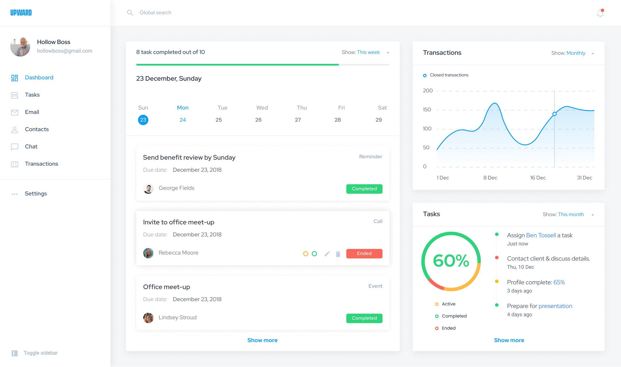
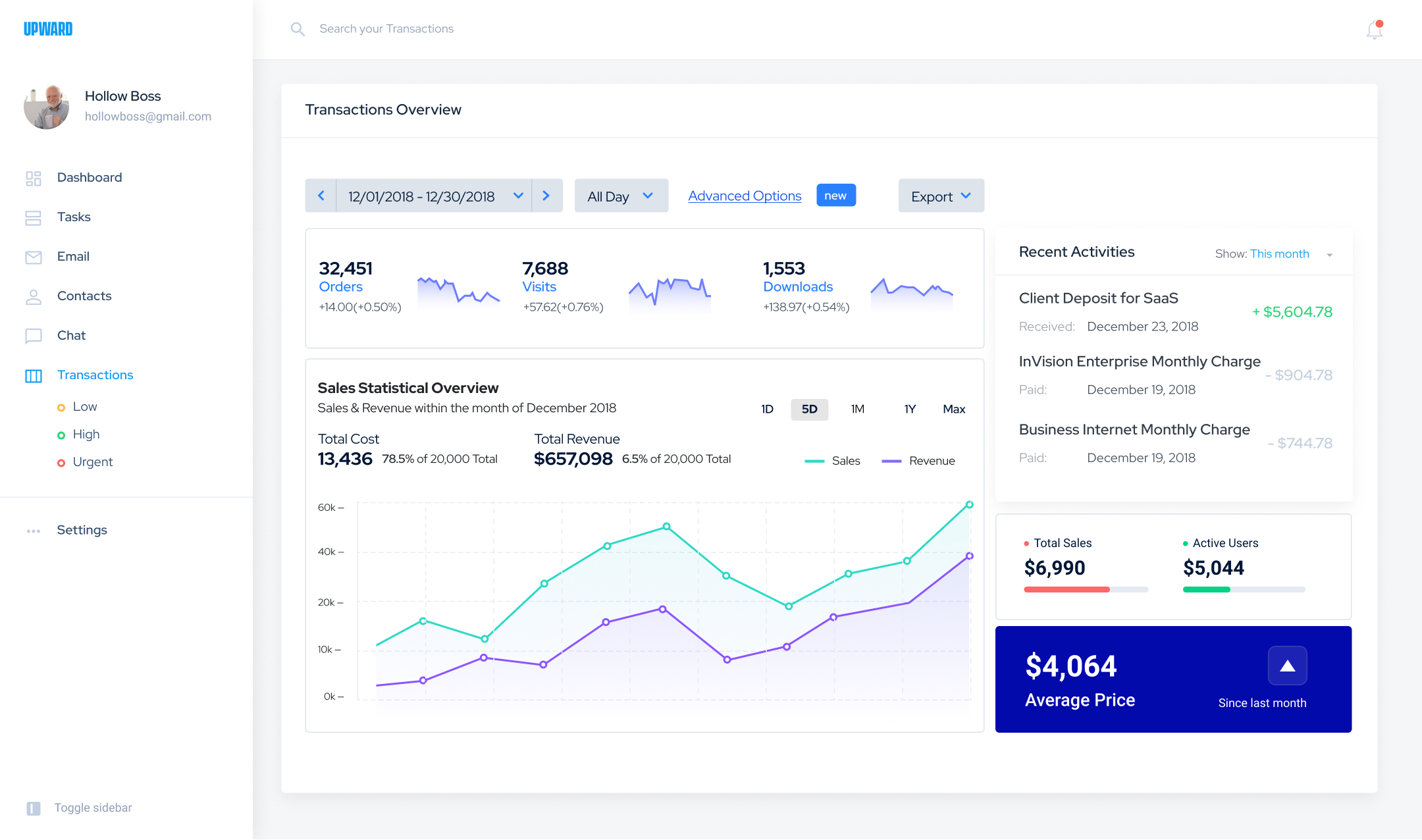
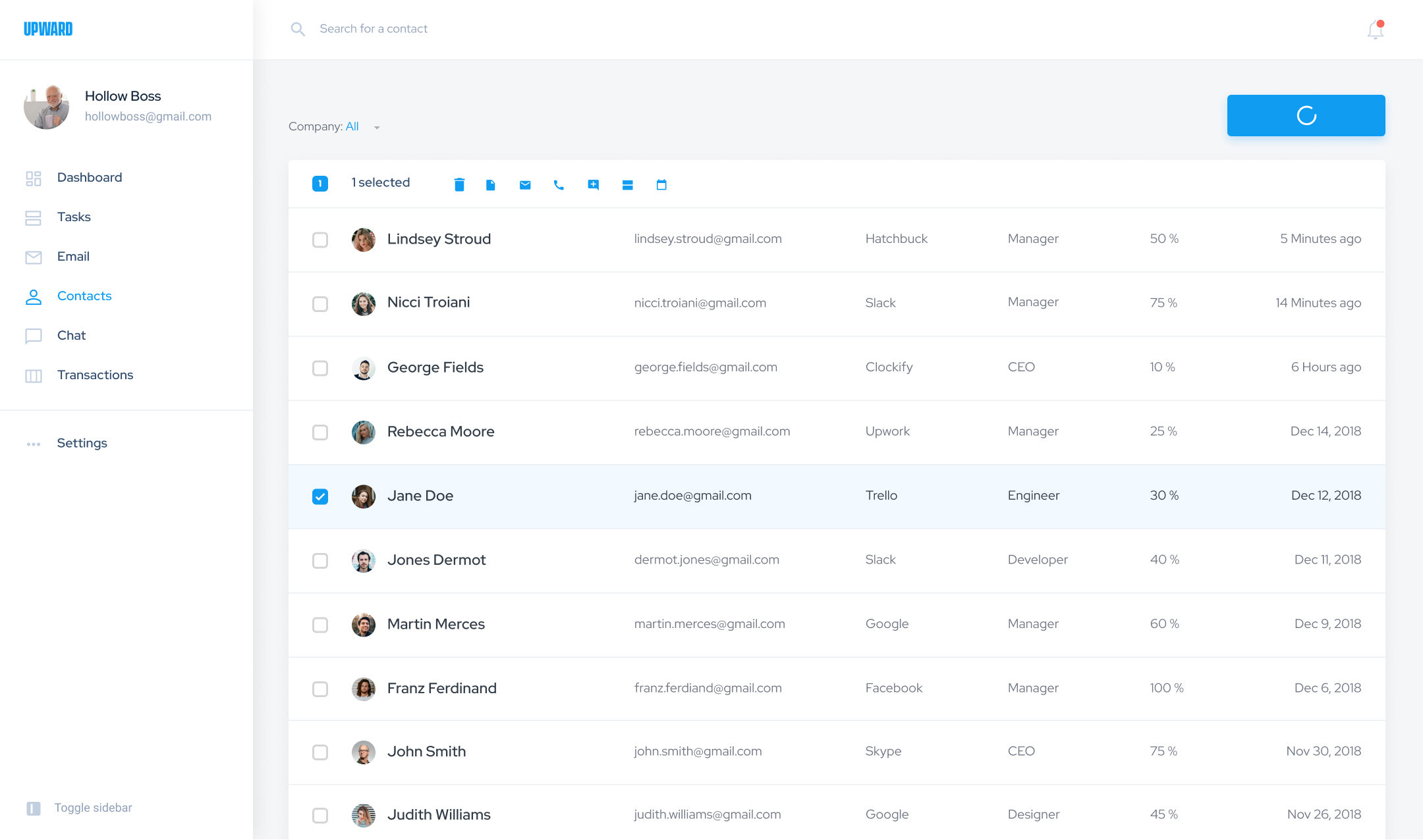
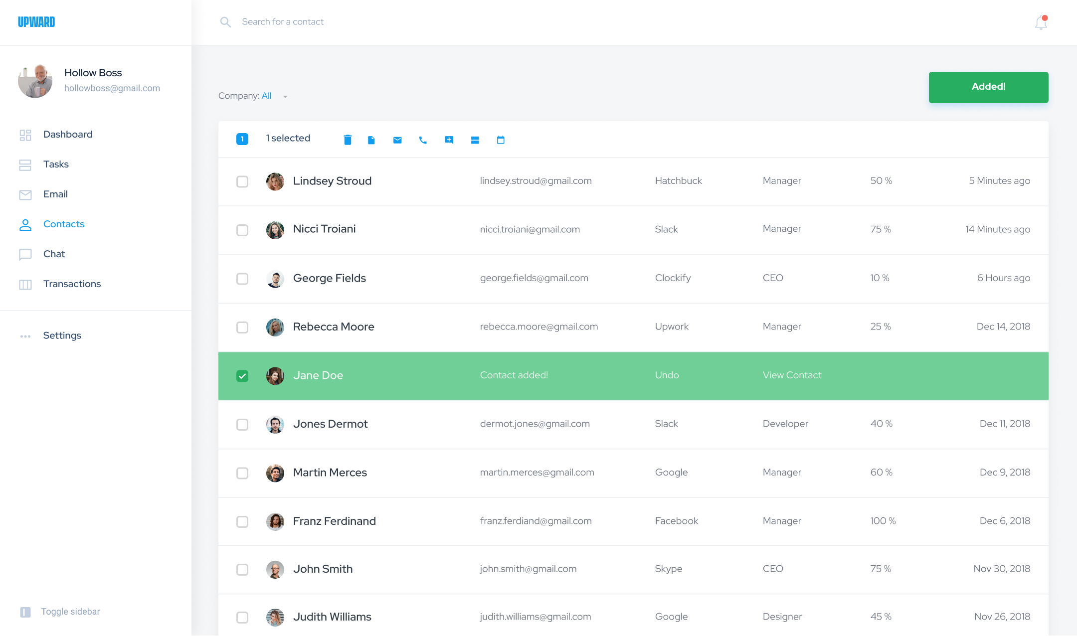
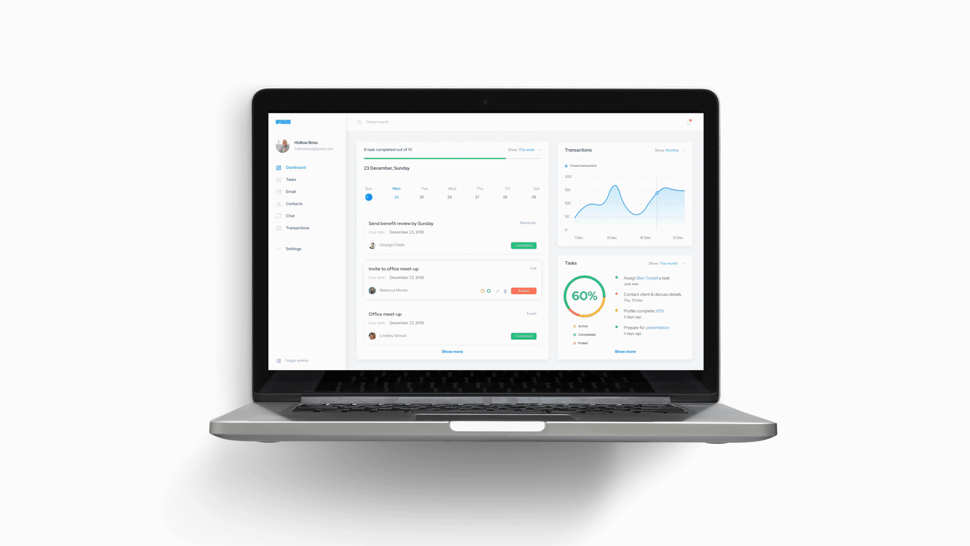
- View transactions and recent activies at a glance: Upon accessing the Upward dashboard, the user is greeted with relevant information for the user to enact faster methods to initiate necessary tasks and contact appropriate clients, individuals, and members.
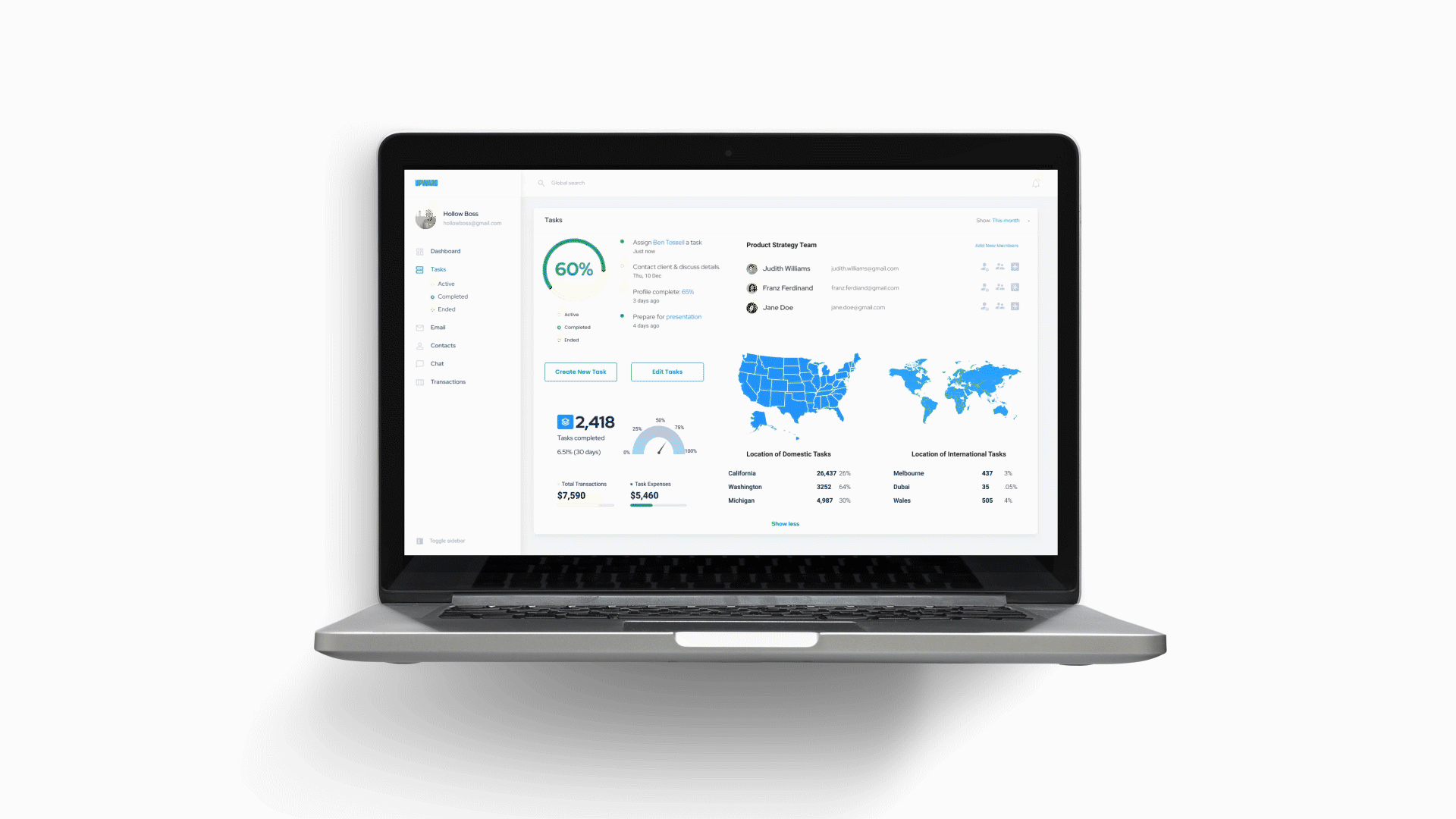
- Categorize data for easier retrieval: By categorizing information and data, the dashboard not only contains crucial information based on categories defined by the user but also provides a quick snapshot of activities and transactions easily accessible & ready to be sent out to desired users.
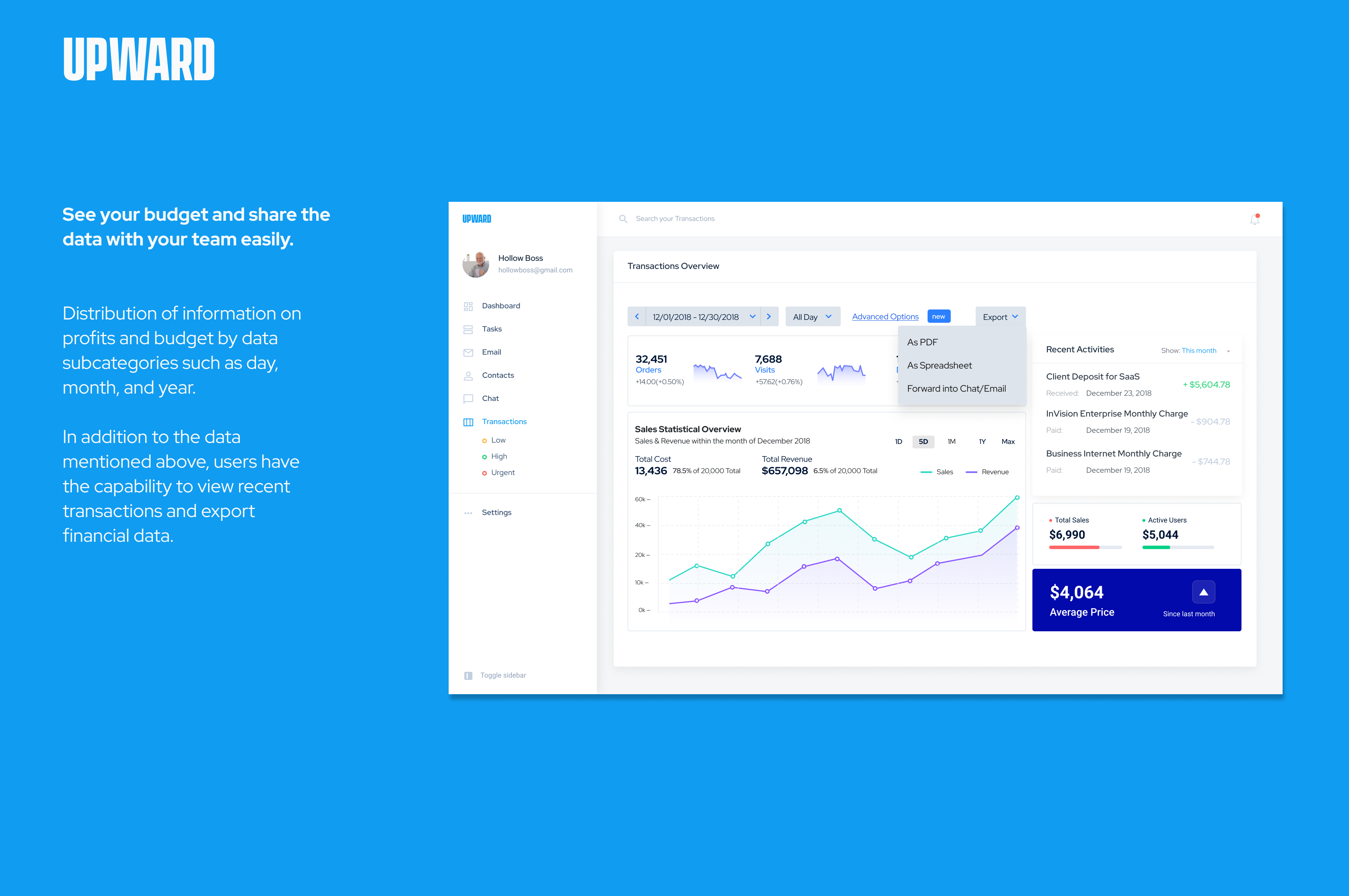
- Breaking down the tasks set: With a more methodolical approach on how tasks are set, the users involved with the task have much more clarity on the current status of the task(s) at hand.
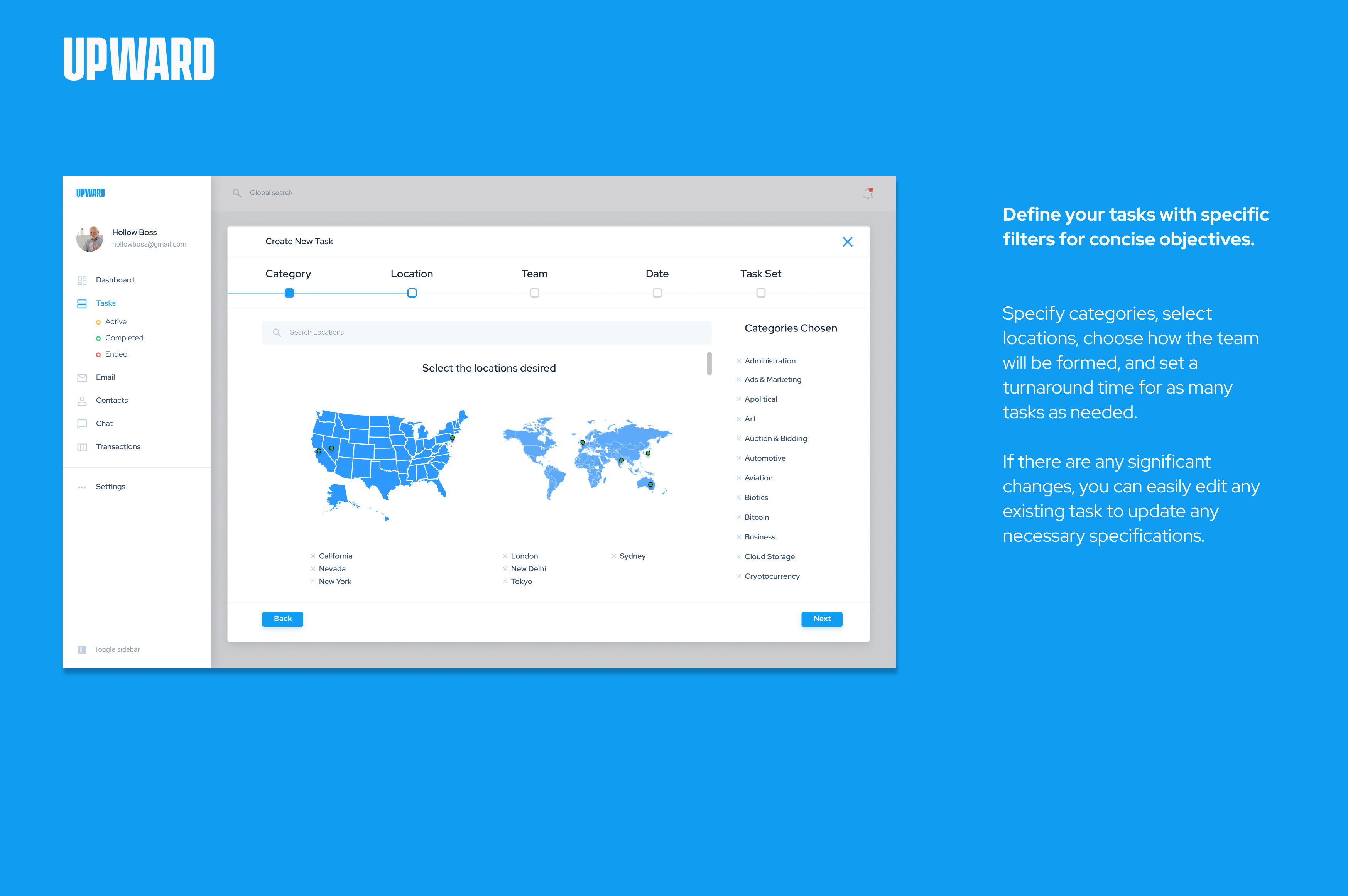
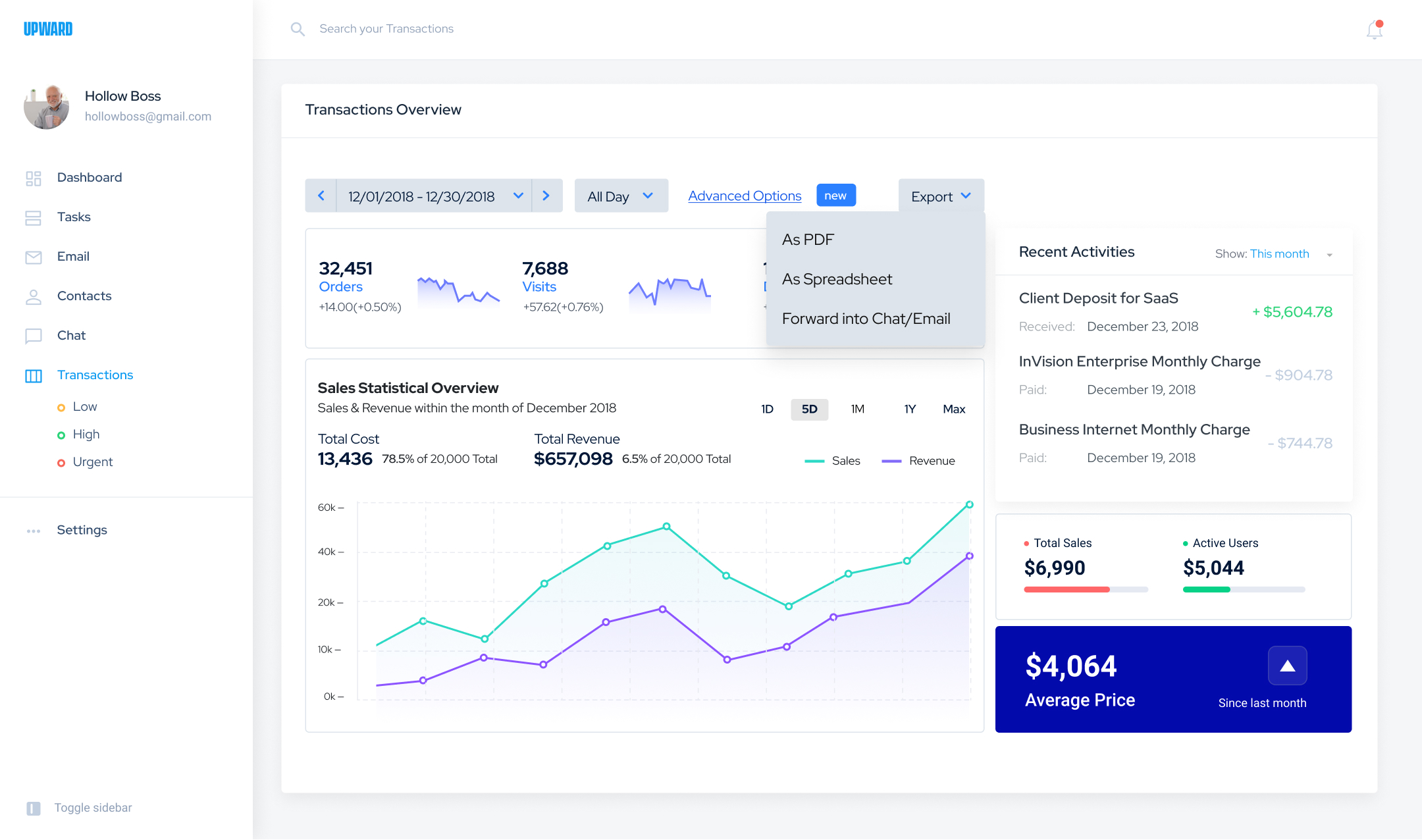
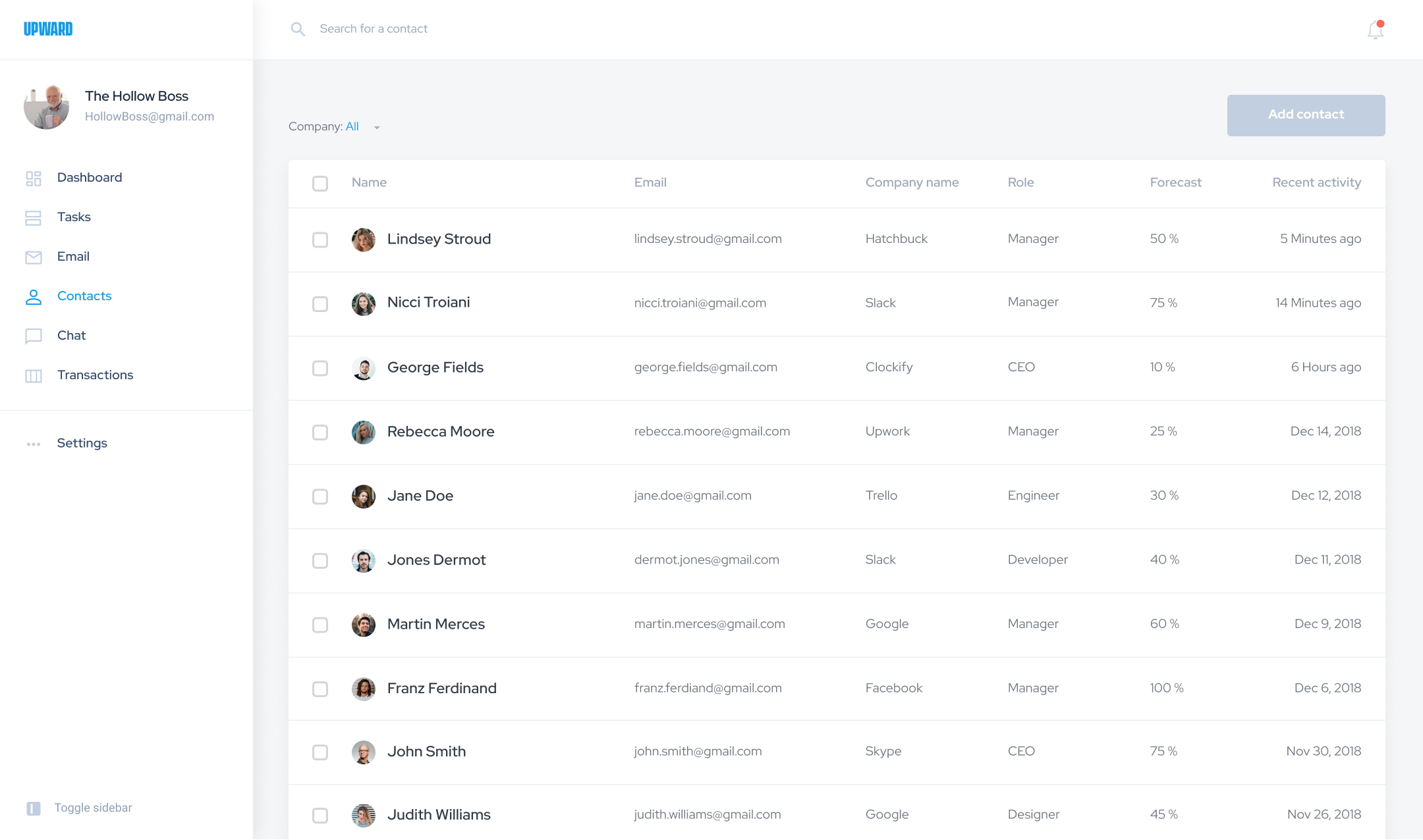
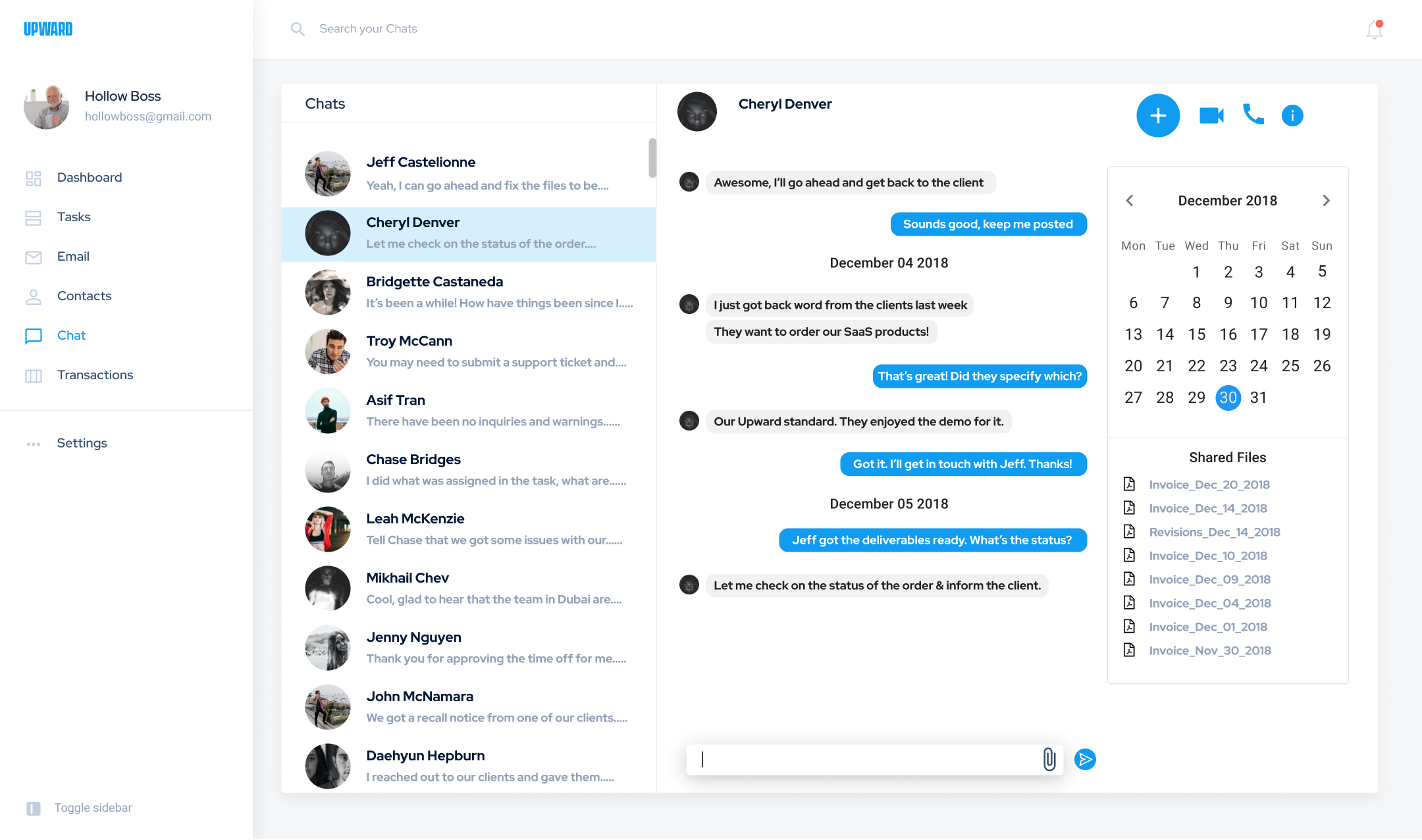
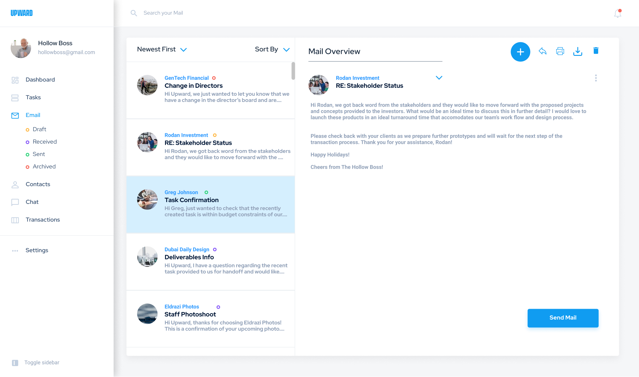
- Reach out to desired users and individuals, by chat or email: Upward has a dedicated dashboard that provides the user communicative options to reach out and get in touch with other desired users, share necessary files & documents, and to have a better sense & security of tasks at hand, product integrity, and ensuring all projects and tasks don't go over budget.
Before getting started on the dashboard, we needed to understand and comprehend on how to display these elaborated points. All user types need to have these essential factors be implemented towards the Upward approach on a more optimized application and seeing all significant insights at a glance. A set of questions are established to provide a better sense on how to improve the Upward methodology:
Setting up the Design
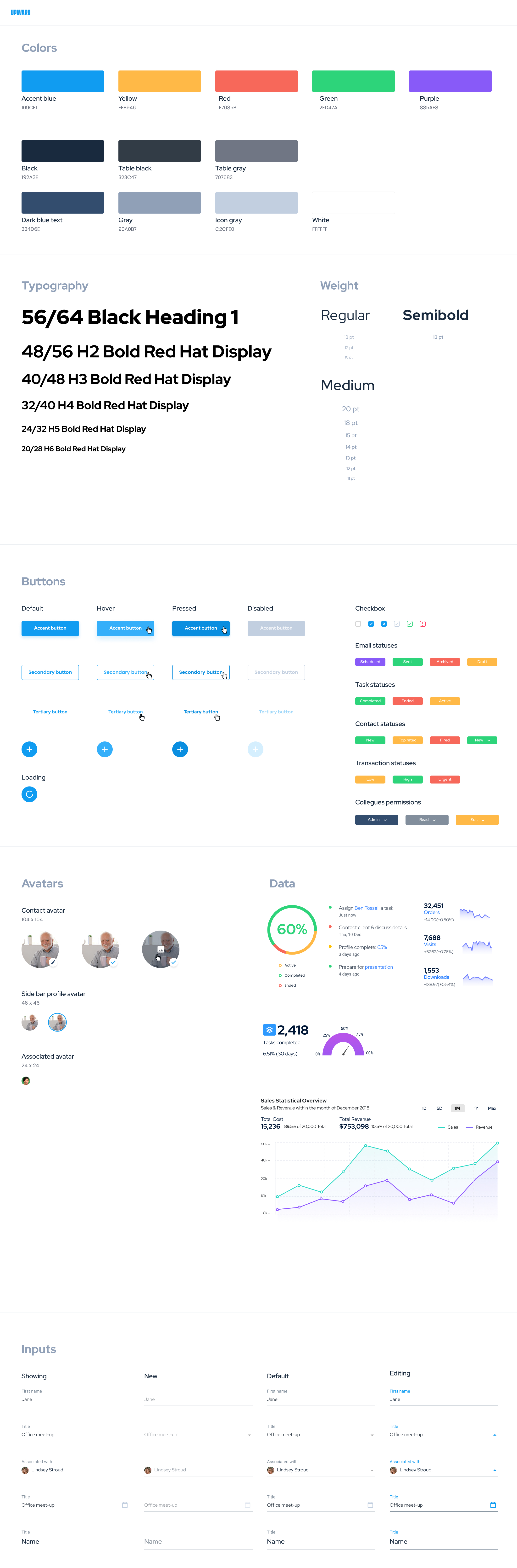
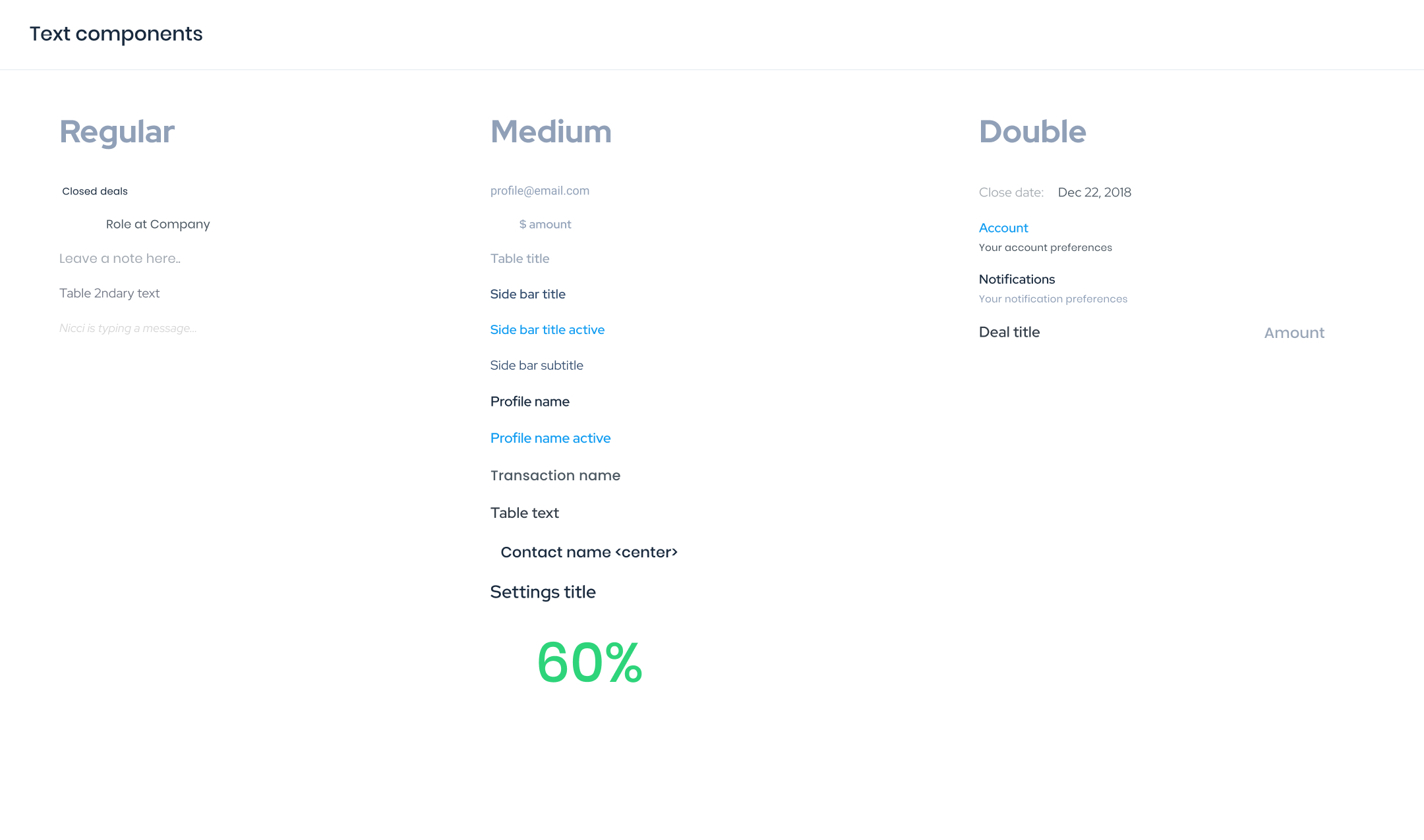
To further assist in visually differentiating relevant information and insights, a style guide is established and is accompanied with necessary components.
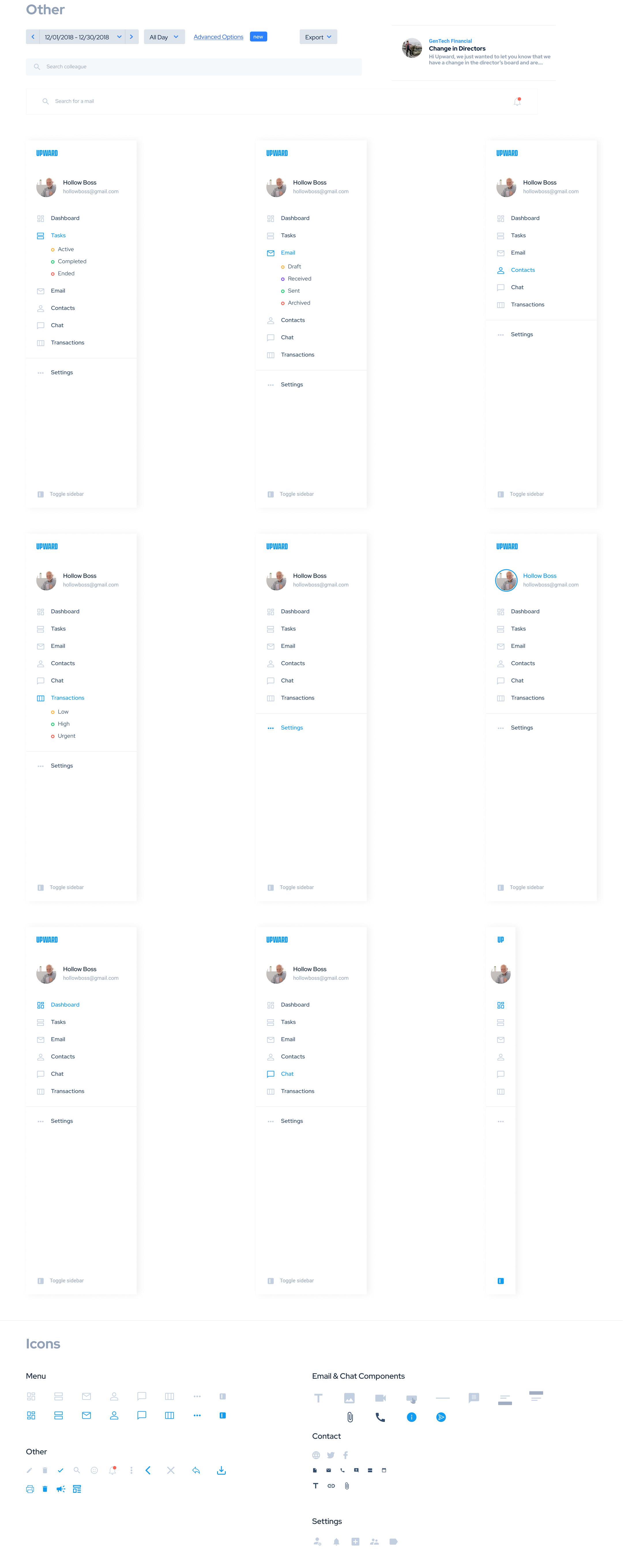
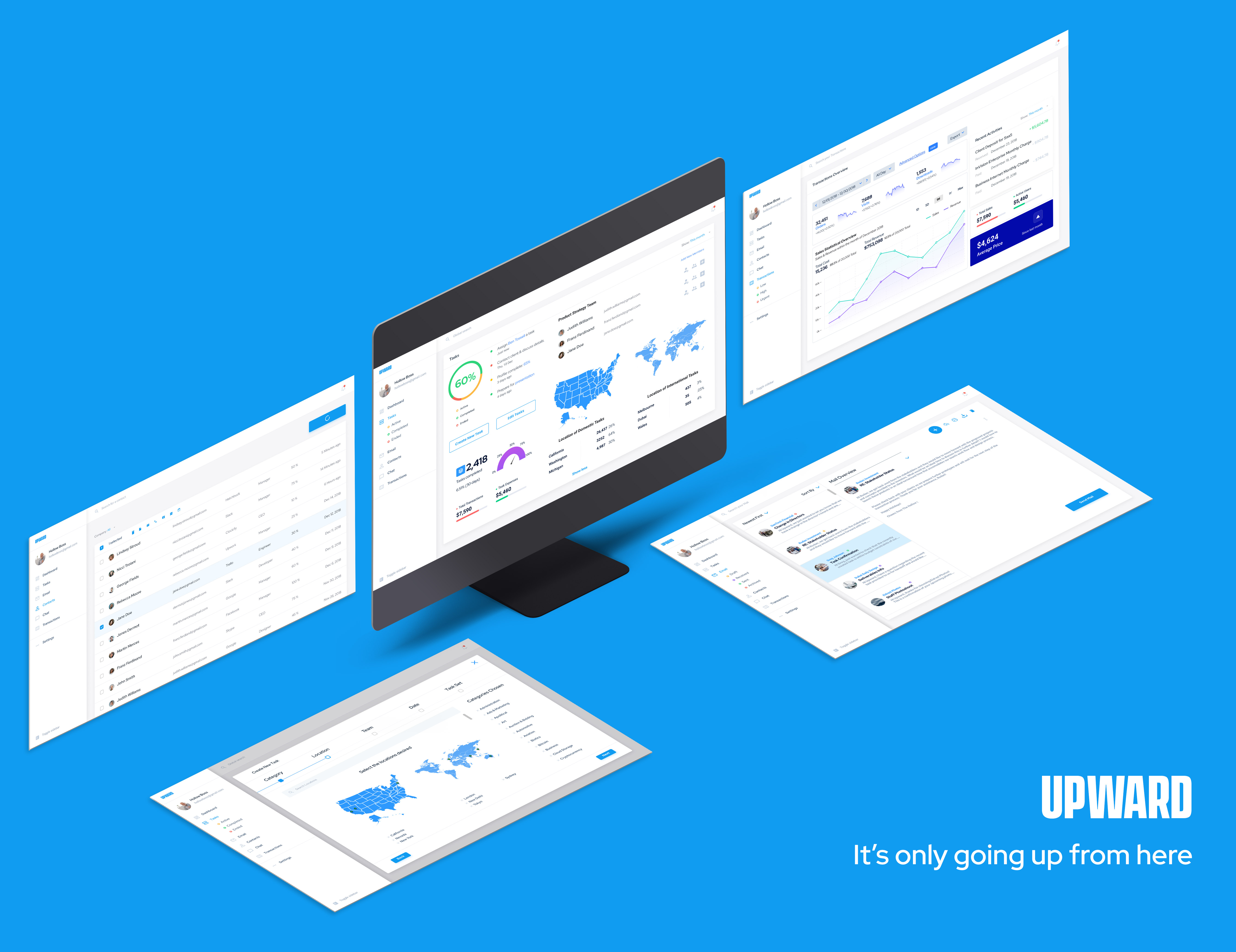
Ideating the High Fidelity Screens
With the finalization of the dashboard screens, the components, states, and assets are placed in a focused manner for easier access on insights and information pertaining to the user's needs:

It's Only Going Upward from Here
The premiere SaaS dashboard rolled out in December 2018. The tool contains and organizes data with consideration of the users utlizing the program. We then apply the right methods to display insights, tasks, clients and contacts, budgets, and the entire enterprise.
- View transactions and recent activies at a glance: Upon accessing the Upward dashboard, the user is greeted with relevant information for the user to enact faster methods to initiate necessary tasks and contact appropriate clients, individuals, and members.
- Categorize data for easier retrieval: By categorizing information and data, the dashboard not only contains crucial information based on categories defined by the user but also provides a quick snapshot of activities and transactions easily accessible & ready to be sent out to desired users.
- Breaking down the tasks set: With a more methodolical approach on how tasks are set, the users involved with the task have much more clarity on the current status of the task(s) at hand.
What I've Learned & Personal Thoughts
It was a monumental and arduous task working with organizing, condensing, and displaying a sufficent amount of variable data for users of Upward. Consideration of the user is a pivotal factor not just on a singular level but also on a status level within the company as we have to look at the different behaviors and personality of each group because each and every user will more than likely have their own approach that may not be synchronizing with others. Each administrator deals with their own set of challenges, so providing data in a way thats quick at a glace and giving them the information they need most empowers them to do their jobs better. Designing the graph along with the settings to filter out data has been a complex problem. After doing more user research and testing, I slowly figure out the trends in what the stakeholders were looking for in terms of being up to task on projects assigned within Upward.