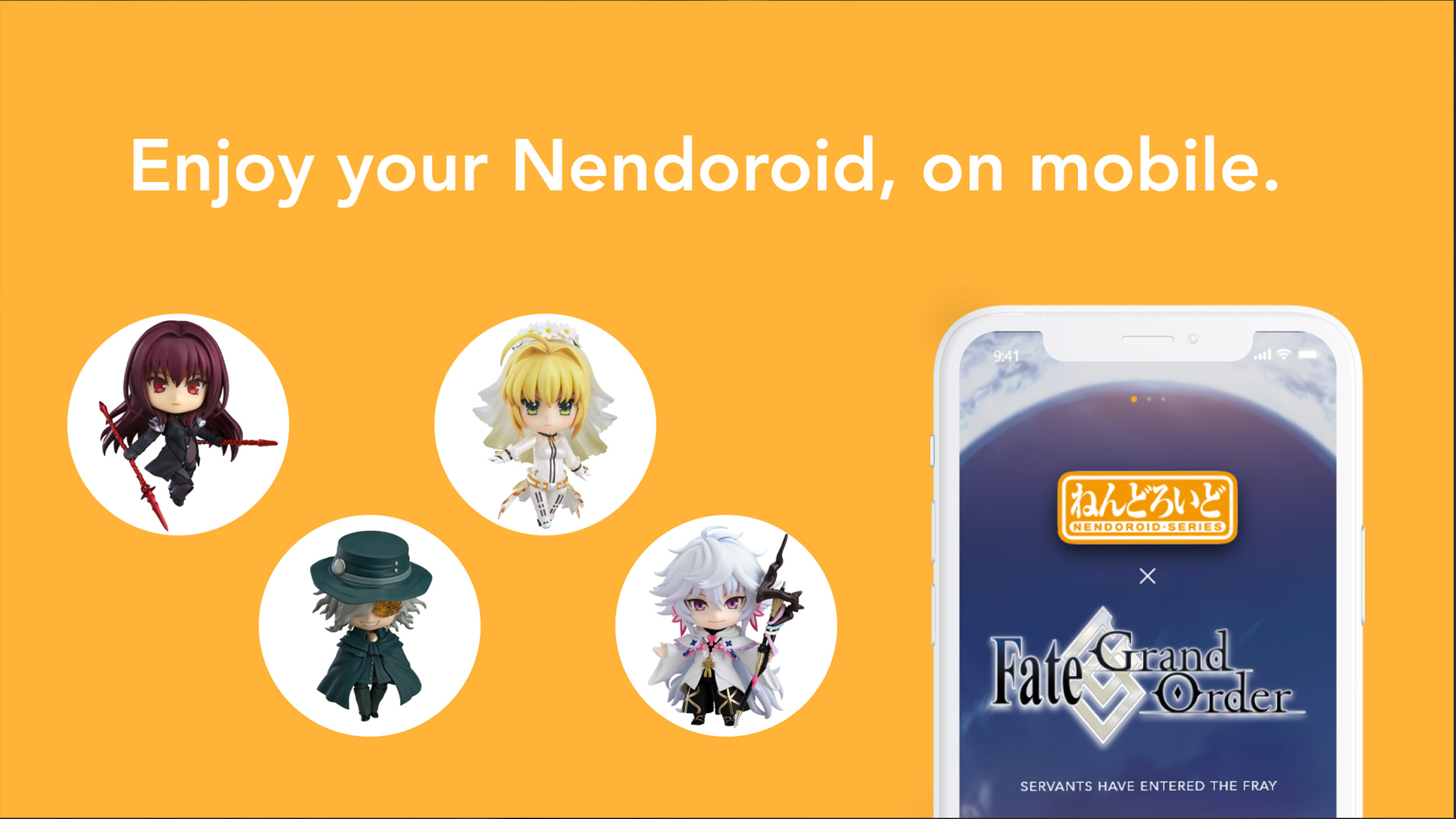
Japan's Premiere Shop for Hobbyists
Mandarake. Just the name of the store brings back fond, vivid memories of the two trips I've had in Akihabara, with various shops all over the country, this is the mecca for hobbyists who want to purchase hard-to-find merchandise from several IPs and genres, and as an anime fan, there's so much to sort through in each of the store, you're going to have to give me a solid month to navigate through every store (I'm serious about this, there's a ton of merchandise and items to sort through in their stores). It's always a fun treasure hunt, and I tend to leave with at least one item purchased. Thankfully, Mandarake's got a website so that being able to purchase goods is convenient for those who aren't able to travel abroad and go to these stores in person.
Design Overview:
The advent of internet shopping is pivotal for users to seek items through the web, sometimes even abroad should they purchase what they want & seek the applicable businesses & sites that offer them shipping to their own country ( aka proxy services ). Mandarake offers a solution for users abroad to purchase second hand collectibles from Japan.
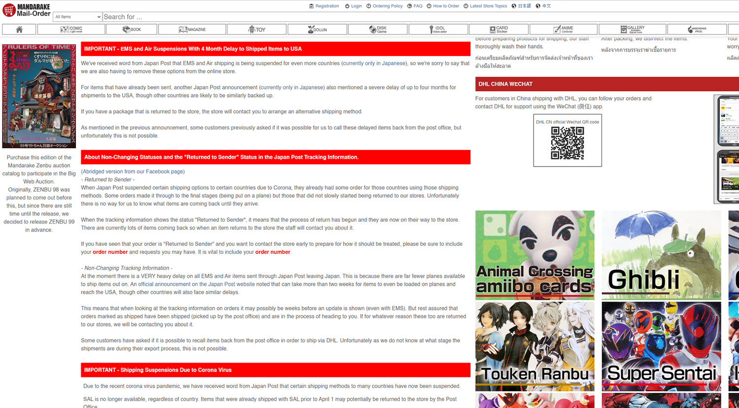
Current Mandarake Pages
The thrill of finding that rare merchandise that you can't find back home is definitely one of the most fulfilling experiences any hobbyist are fondly proud of. Although Mandarake has that spirit right in how they express it online, there's just certain experiences that are much better left off in person. Doubly so for an end user that utilizes the Mandarake website. I mean........
The Client
Mandarake & Users of Mandarake
The Challenge
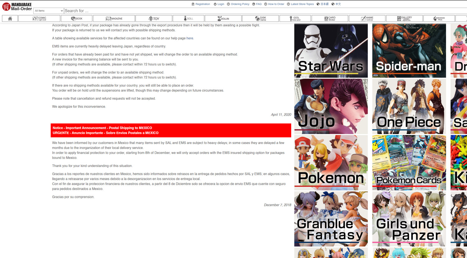
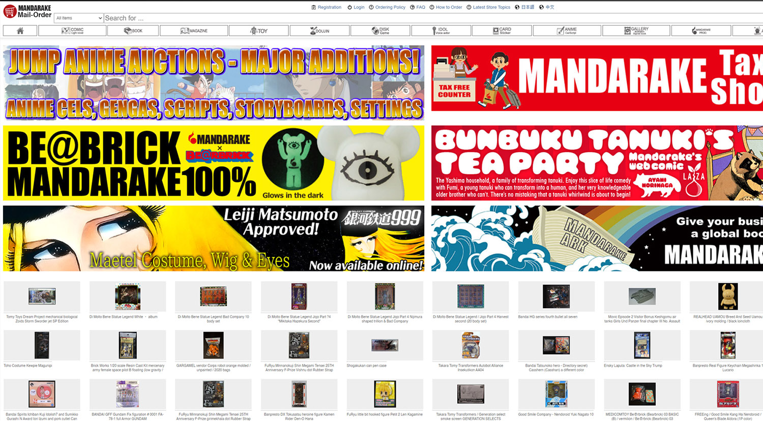
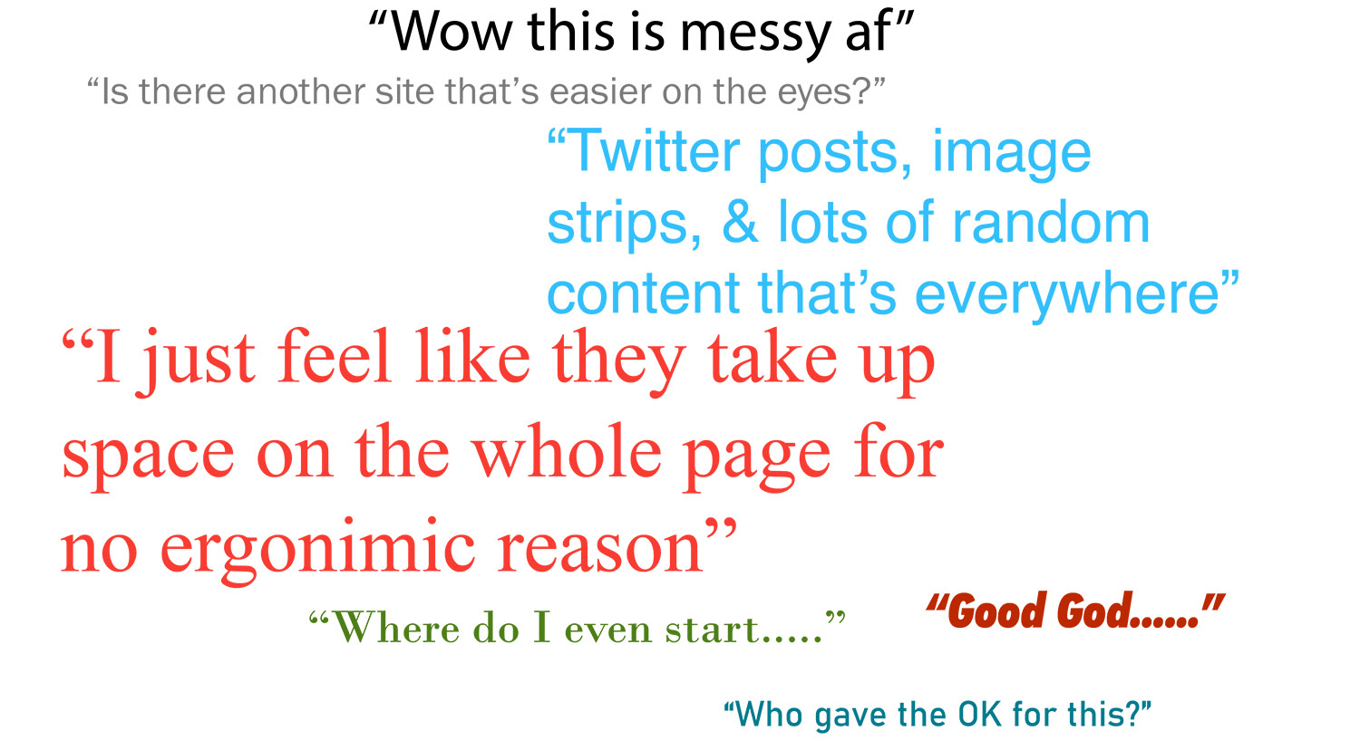
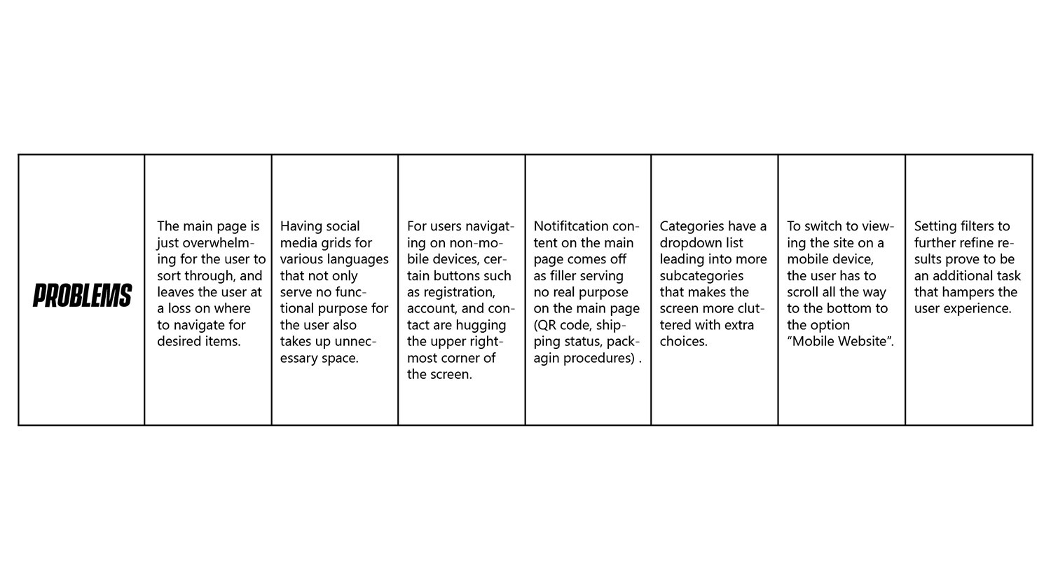
The website, as it is, is a jumbled mess. There is just too much going on on the main page with a lack of established
heirarchy to assist the user on navigating around the site efficiently, and relies on stranded square images of popular
franchises to click on. To address these issues, I've asked select users to navigate this site and provide feedback regarding the tasks
requested:
• Look for items based on brands shown on the site. How did it go?
• Navigate the website. Elaborate on how information is displayed.
• How is the item detailed for the user to view upon clicking it?
• Was the user able to set filters accordingly and without issue?
• The user adds items to the cart. What did they notice?
The Objective
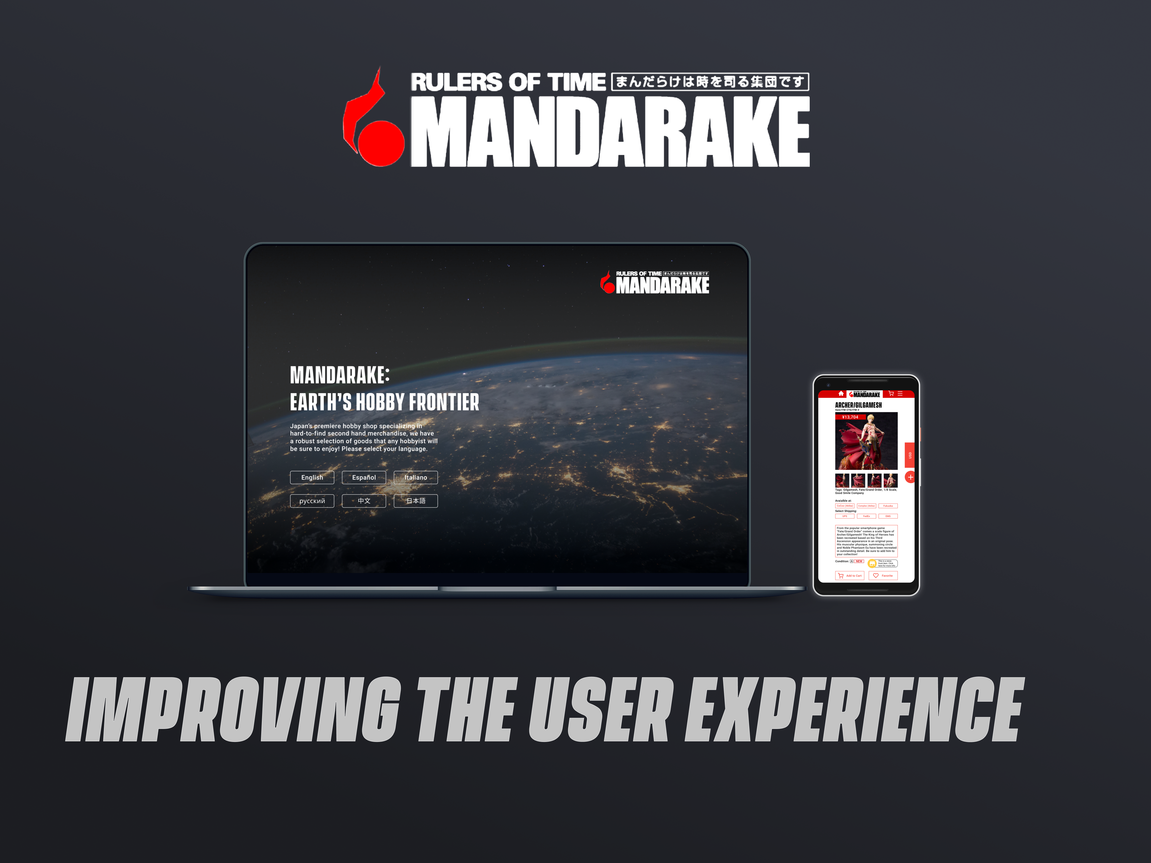
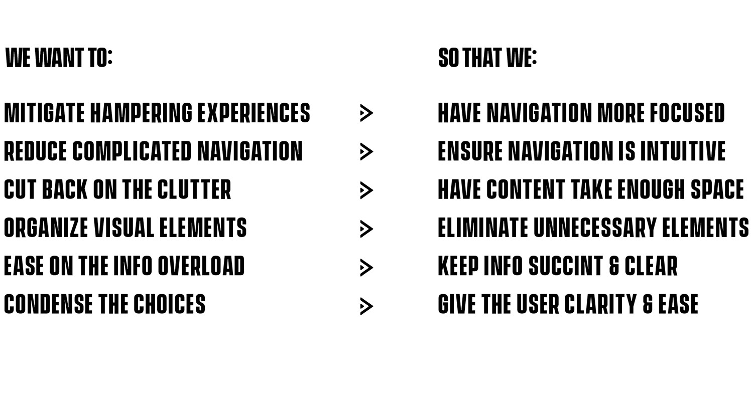
Redesign the current webpage & mobile page into a revised user experience to mitigate information overload, establish a sense of heirarchy with elements & objects displayed on the site, & reduce clutter.
Core Tasks
Tan Nguyen ( UX Designer )
Input from Hobbyists
It's no doubt that utilizing Mandarake as it is is another monumental feat that the user would have to take on to find the merchandise they would like to buy. The priority now is to focus on making the experience more "effortless". To make it feel more effortless, we want to implement the following factors to hasten the user experience in an efficient way: speed, clarity and accessibility.So how can we achieve these factors and implement them accordingly?
Tools Used
• Figma
• After Effects
• Photoshop
• Jira
Setting up the Redesign
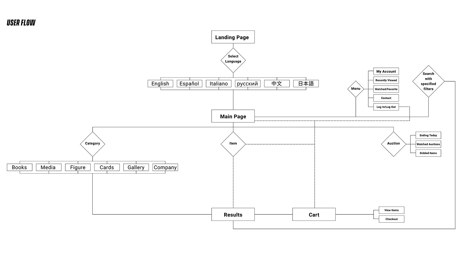
With the data and feedback regarding Mandarake's current website, it's time to redesign Mandarake, now with a user flow & a set of low fidelity wireframes produced that will reflect the final design and navigation process where the user won't be intimidated into trying out a new hobby.
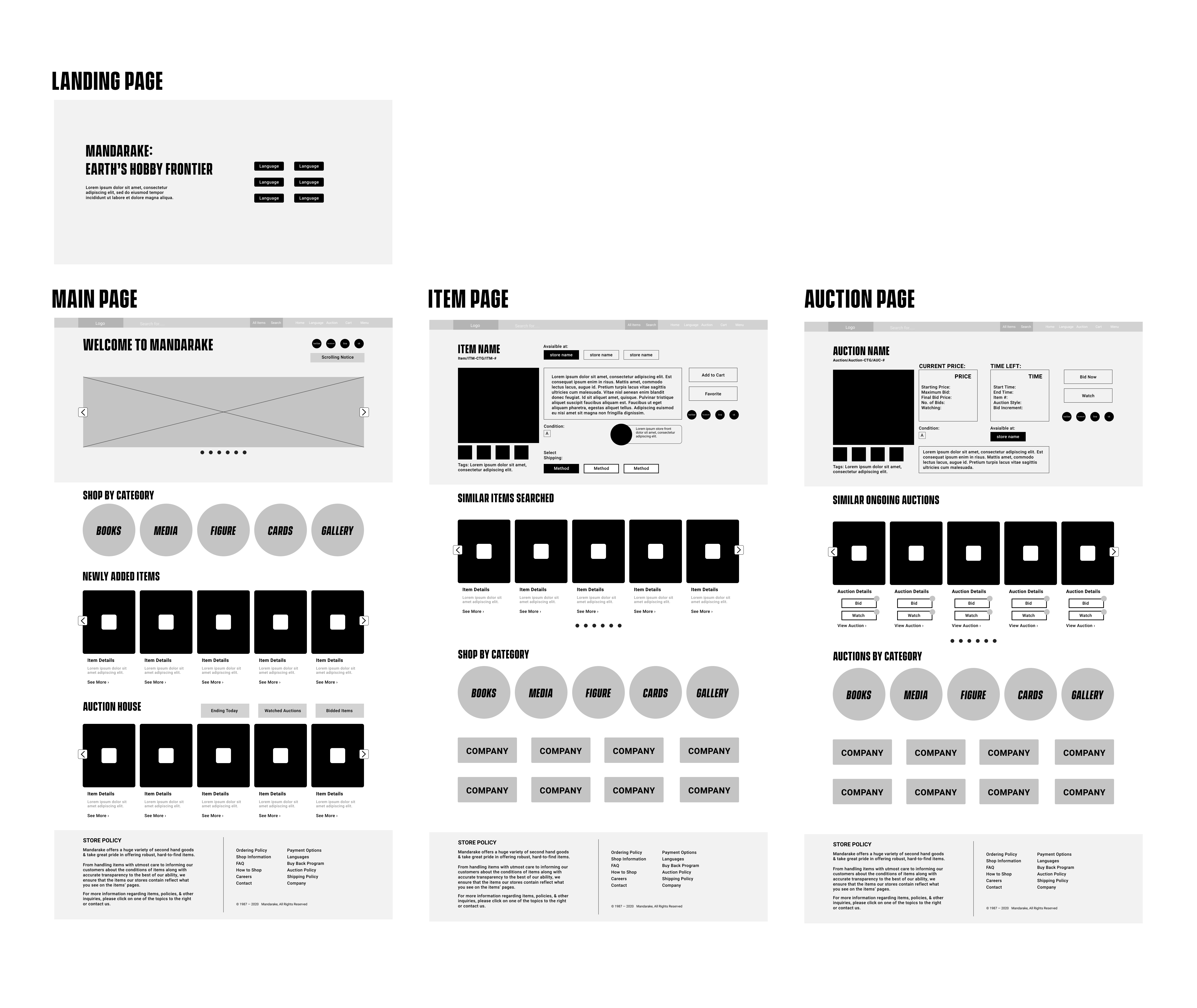
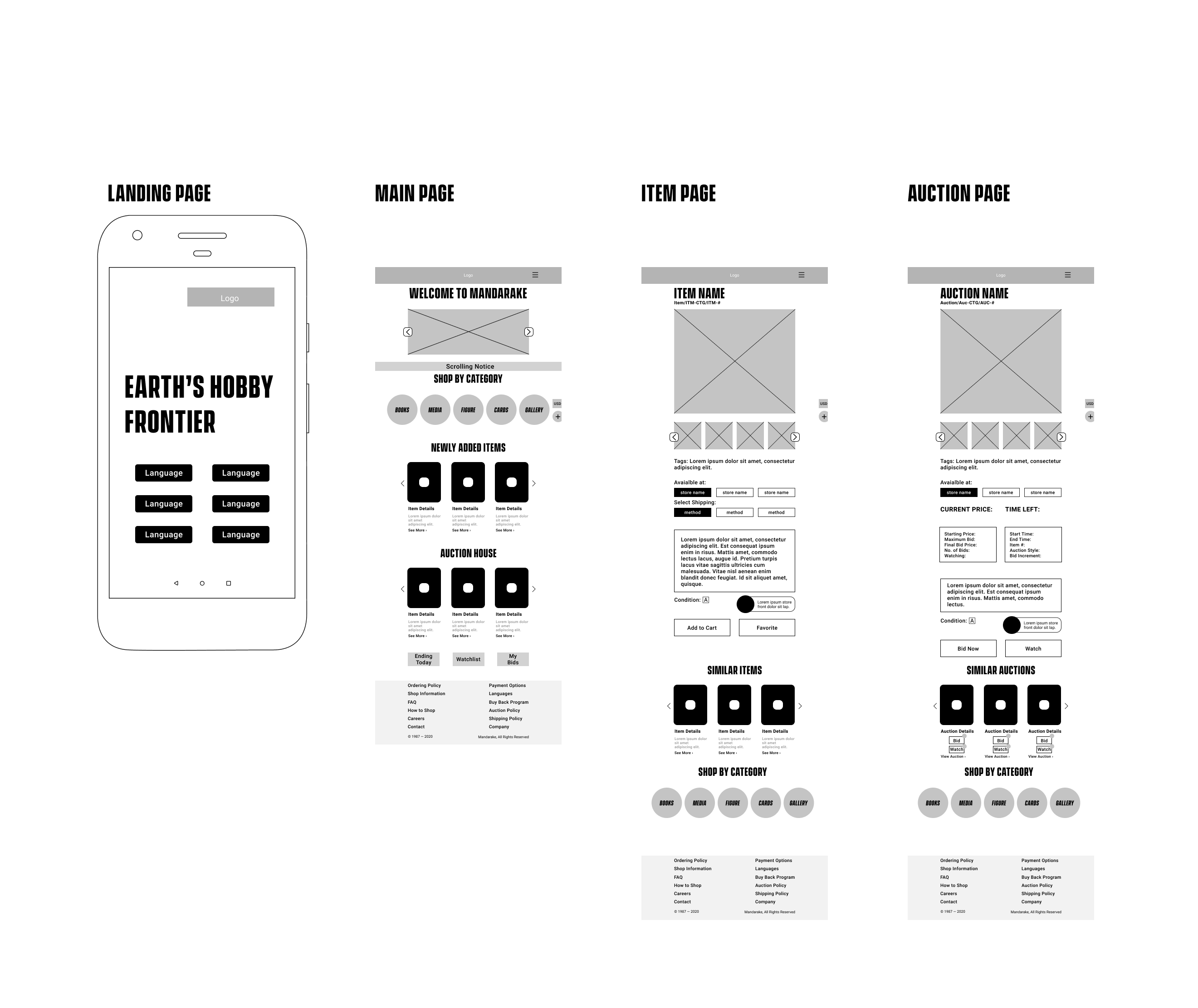
Web & Mobile Usage Results
The users have also complied to testing out this prototype and have given feedback that reflects how this redesign
looks, functions, and displays core elements and information. The feedback received about this has been mostly positive,
with core issues being rectified, along with these prototypes having:
• Addressed the issue of visual clutter
• Established visual heirarchy for the user
• Cut down on overloading the user with unnecessary choices
• Reduced time to navigate through in-game menus on older titles
• Utilized space to make better use of components
What I've Learned & Personal Thoughts
I love venturing through Mandarake in person, but doing so online requires extra effort to navigate and seek what items you want. With me redesigning the website and mobile version, I aimed to assist hobbyists to navigate with ease. As I worked on improving Mandarake's site, I definitely am slowly to begin understanding how pivotal the use of space and objects on the site can impact user experience. Looking back at this, I felt that there some core features that should have been expanded on even further, like the category section and the dropdown menus for specific taps, especially in the mobile prototype. As you can probably see in the mobile prototype above, I could have implemented even more categories and sub categories. The main takeaway points that I have learned doing this project were:
Displaying Necessary Information
Displaying how information is shown on your web page & mobile browswer is crucial for your users.
Reducing the Visual Clutter
Visual clutter affects the user's retention to remain on your site, and with more clutter you have, the less likely the user will stay.
Create Proper CTAs
Applying visual cues for the user to be able to interact with certain objects that branches out to items they seek.
Venturing through Mandarake is an experience that many hobbyists should partake in when visiting Japan. A cluttered, overbearing user experience should definitely be something that no one should experience. With the considerations towards a more minimalist, condensed site, I have learned a lot of factors that come with making the website & mobile version functional, succint, & retain users from start to finish.